Redoc UI-Components
Component library for Redoc web applications
The main objective of creating the various components was to enable their use in both the Redoc web application and the Redocflow application. This facilitates maintenance for developers, enhances usability, and accelerates the development process.
Client
Redoc.mx
Technologies
Svelte Pico CSS
Date
September 2023
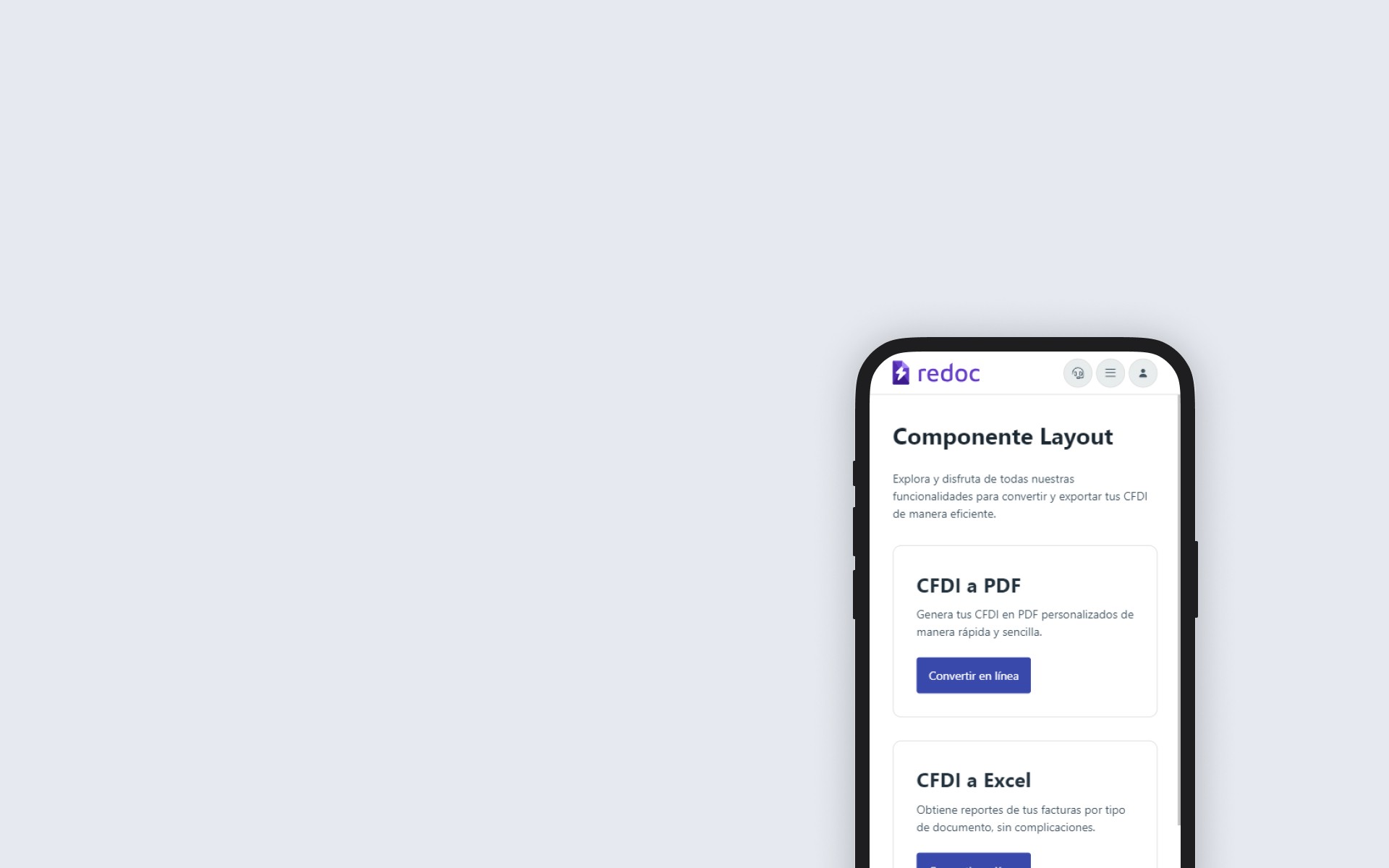
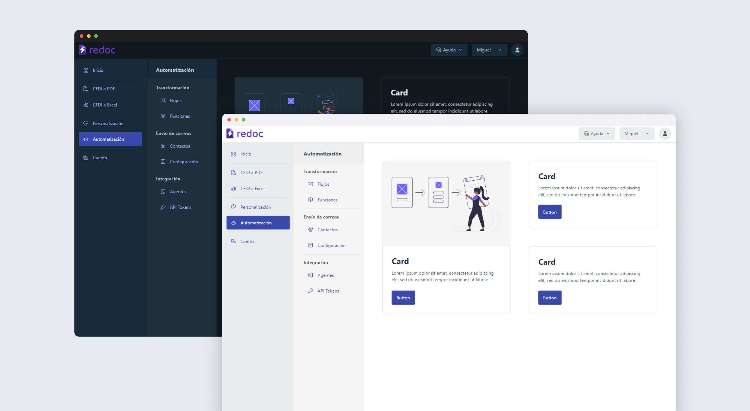
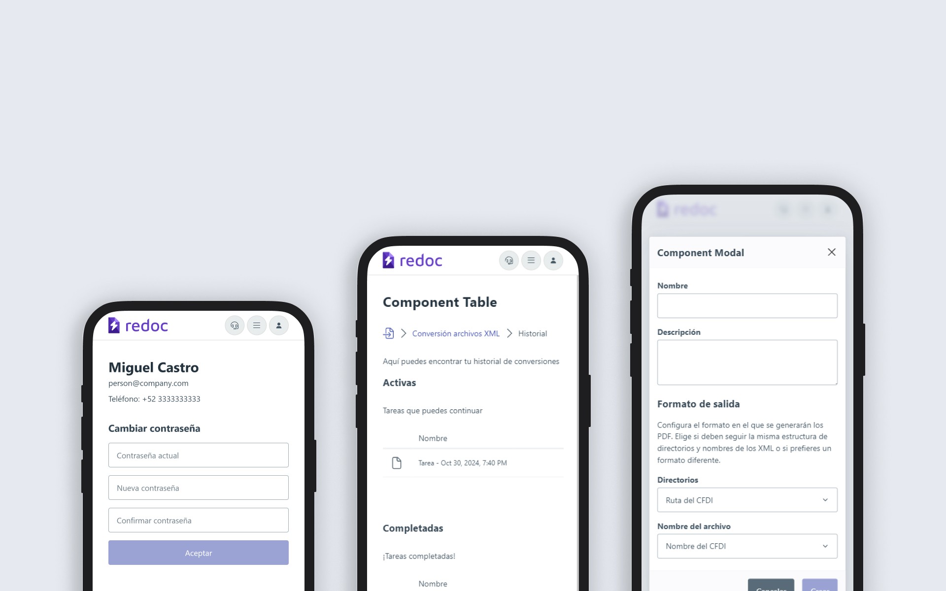
The various components were developed with a focus on meeting accessibility standards, web performance, and responsive design. By utilizing tools like Pico CSS, greater design coherence was achieved across web applications. These components were created to provide various functionalities, such as style filtering, application layout design, color selection, modal usage, and more. This enabled efficient web application development and allowed for the separation of service logic from reusable components, providing better control across different projects.
Each component was documented in Markdown, detailing its properties, callbacks, and usage methods. This allowed developers to quickly understand how to implement the components.


